Why we folded the filmography section on every performer page
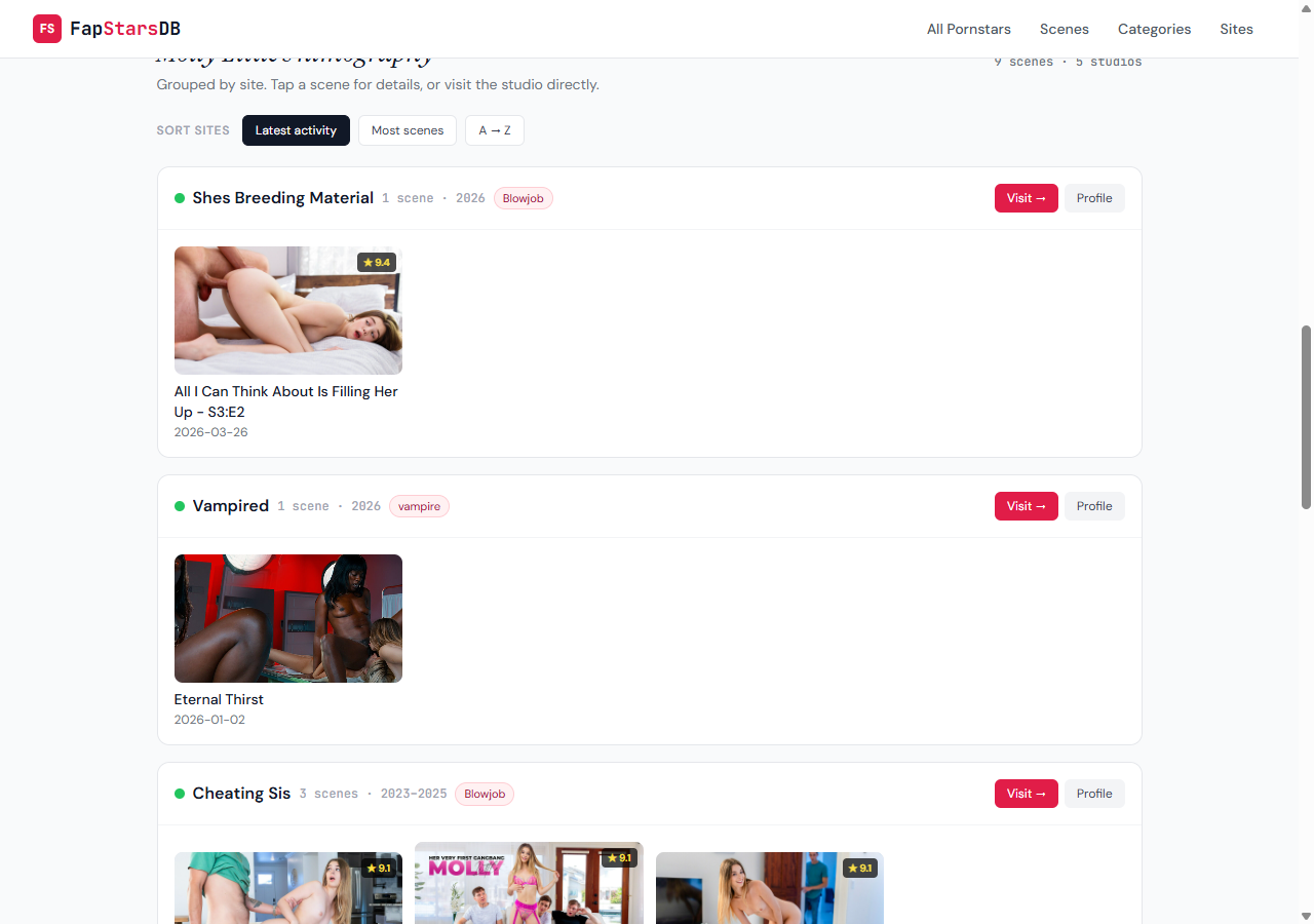
The performer page used to show the same scene thumbnail twice — once as a studio card on top, once again in the scenes grid below. We replaced the two sections with one folded layout where each studio is a row and its scenes nest inside. There's also a sort toolbar now, and the default order changed from “most scenes” to “latest activity.”
Until this week, every performer page on FapStarsDB rendered two sections back-to-back: Where to watch X — a row of studio cards each topped with a representative scene thumbnail — and Recent Scenes, the standard scene grid below. Looked normal in isolation. Looked silly in practice, because the “representative thumbnail” on each studio card was the most-recent scene of that performer on that studio. Which is also exactly what showed up first in the grid below. Same image, twice, on the same page, for most of the catalogue.
How the duplication crept in
The studio card’s featured_thumb is computed at build time as the first scene’s thumbnail of the performer-on-this-studio combination. Scenes are sorted newest-first. So featured_thumb = newest scene’s thumb. The scene grid below is also newest-first. Which means the very first thumb the visitor sees up top is, in 100% of cases, the very first thumb in the grid below.
For someone like Adel Sunshine (2 scenes across 2 studios), this meant 2 of 2 scenes were rendered twice. For Molly Little (9 scenes across 5 studios), all 5 studio cards repeated the most-recent scene from each — 5 duplicates inside 9 scenes. And we’re very early in the catalogue: ~83% of indexed performers are still in the ≤5 scenes range. The pattern wasn’t an edge case, it was the default experience.
What we tried and what we settled on
The first instinct was to just drop featured_thumb and keep the studio cards textual. That kills the duplication but turns the studio strip into a featureless row of metadata. We tried it and it felt like a regression. Studios are part of the performer’s identity on this site — they deserve more than a bullet list.
The second option was tabs: one section, two views (“by scene” / “by studio”), user picks. Cleaner, but it hides half the information behind a click on every load. Crawlers technically still see both panels, but the click tax is real for visitors and is, in our reading, the wrong default for a profile page.
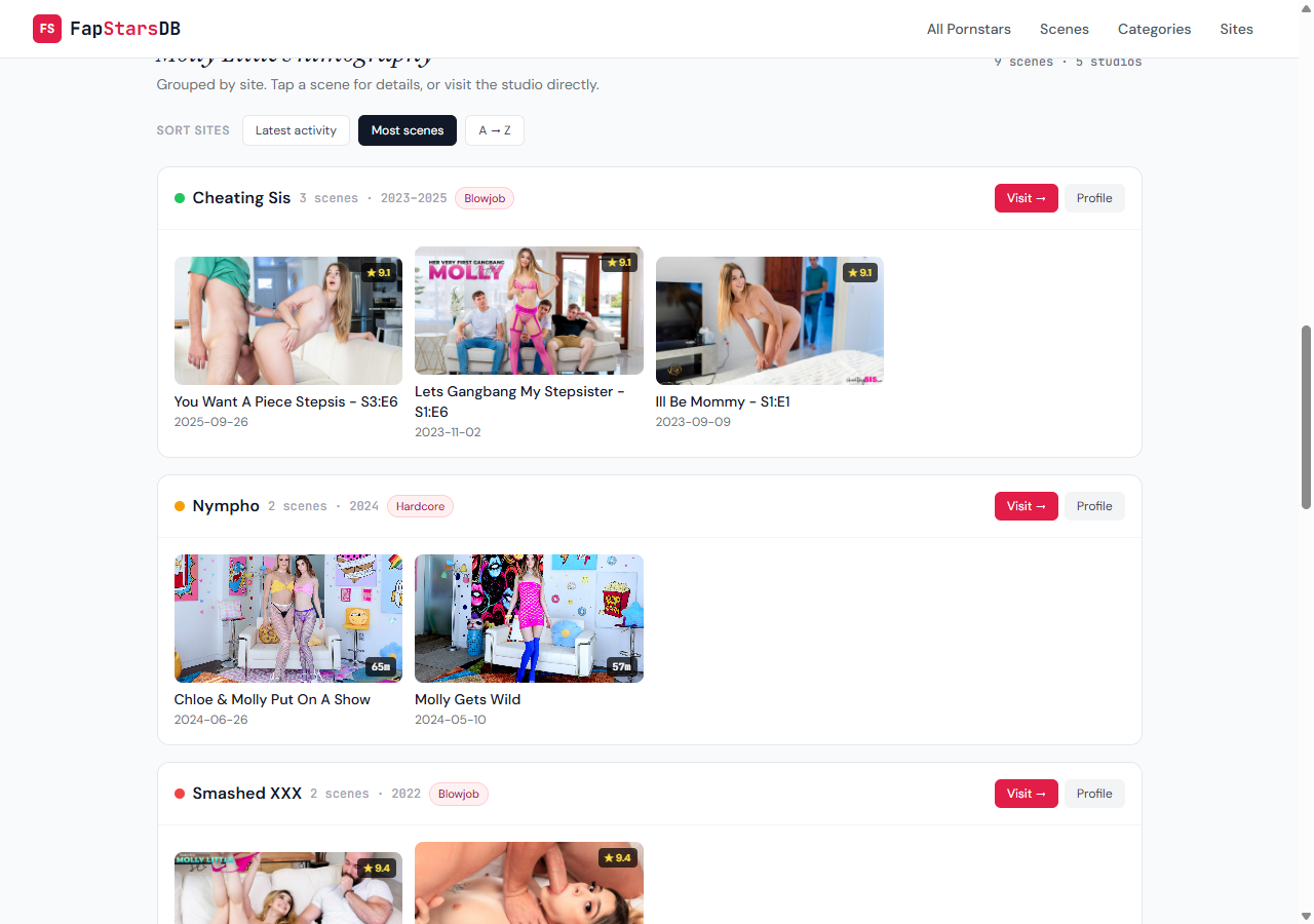
The third — and the one we shipped — folds the two sections into one. Each studio becomes a row: the studio header on top (status dot, name, scene count, year range, primary category, Visit and Profile buttons) with that performer’s scenes nested directly inside as a 2/3/4-column grid. One image, one place. The scenes are still all in the DOM, all crawler-visible, all clickable to the same scene-detail modal as before. Nothing is collapsed or capped — just regrouped.
The sort toolbar, and why the default changed
Above the new section we added three pill buttons: Latest activity, Most scenes, A → Z. The toolbar only renders when a performer is on more than one site — otherwise there’s nothing to sort.
The default used to be “most scenes,” which is the production order under the hood. We flipped it to “latest activity” — studios sorted by the most recent scene on that studio, descending. The reason: the question we think a visitor is most likely asking when they land on a performer page is where is she shooting now? — not where does she have the largest backlog?
For an active performer on a small new studio plus a retired big one, the old default buried the new work behind the old. New default puts it on top. If you specifically want volume-first, click “Most scenes” and you get the previous order back.
What stayed the same
The hero call-to-action See where she performs → still anchors to #where-to-watch; the section id was kept on purpose so old links don’t break. Affiliate /go/ CTAs, scene modal behaviour, FAQ schema, BreadcrumbList — untouched. Site cards are still ordered top-to-bottom, not in a grid, so nothing is hidden off-screen and the studio-level navigation is denser than before. Studio profile pages at /sites/ are unchanged.
The internal change is small — one Jinja section in one template. The visible effect is that every performer page just got tidier.